
Log/Skills
I have uploaded a JPEG file of my front coverand contents page of my College Magazine.
This is my Media coursework; which is a magazine based on activities and Educationally based Themes which are highlighted at the front of the magazine to attract a specific type of audience which are students
specifically in college from the age of 16-20
This is my Media coursework; which is a magazine based on activities and Educationally based Themes which are highlighted at the front of the magazine to attract a specific type of audience which are students
specifically in college from the age of 16-20
|
|
|
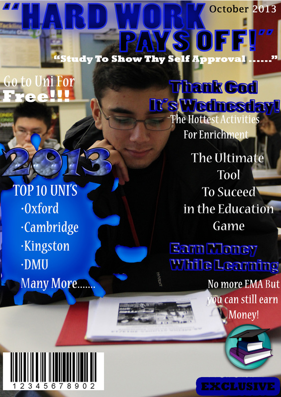
One the front page of my magazine I used a blue colour scheme as my main cover line and this was really helpful as I could base my magazine on one colour which is very effective. Also from the creation of this front page I have learnt how to:
What didn’t go well in my magazine was the main image and the positioning of the text. The main image used juxtaposed its background as the picture is meant to show a student studying but in the background another student has his hood up with juxtaposes the theme of a Good school and studying student that was ideally meant to be set. In addition to this, the main image has text on the face which did not go well as I couldn’t not change or shrink the font to a smaller suitable size. From this I believe I am a bit more comfortable with Photoshop and I have gained much more experience even though I have used Photoshop before. |
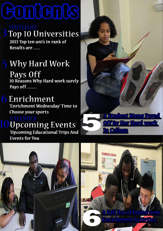
This page consists of 3 different images which where all captured by me and edited into this Contents page.Furthermore in this contents page I used the type tool a lot and when into greater depth of text editing. This was very challenging at the beginning as it took a lot of time and precision to get the right colour blend and text font, but as they say 'Patients is virtue' so it had to be done.Inclusive to this, I also learnt how to convert images into smart objects which allows them to be moved around easily and also allows text to be layered on op such: Image 5 and Image 6. These were the main things that
went well in the creation of this contents page. On the other hand, there were a few things that didn’t go well while creating this context page and this was the spacing of the separate contexts and the transforming of the images. In this contents page, the Space I left was quiet big so this resulted in large gaps between the separate contents on the left hand side. Also, the transformation of the image on the bottom left was a bit different to the rest as space was a major issue and I did not think of making anything else smaller as I thought it was too small already. Ultimately this college magazine has really helped me become more comfortable in using Adobe Photoshop CS6 and majority of the main features.Furthermore I am already an expert in Digital photography and have my own cameras so this made taking photos way easier and less stressful. |
